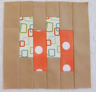
As the spaces fill up, it becomes increasingly challenging to find the best scraps to fill the spot. I really like how this one combines the bright orange of it's neighbour with the more subtle tan colours of the surrounding blocks.
I've found it's not about making things too matchy (which is just as well), instead using colours that reflect their neighbours taste but still make their own statement.
OK - time for a vote, but a bit of background info first. I've decided I should be organised for next year - as I know there will be major fundraising going on for school, and if I intend to donate a quilt (or two), I really need to get started on something sooner, rather than later.
This little Japanese doll inspired quilt on the cover has always appealed to me...
 |
| Obviously all these ladies are doing yoga... |
... I also have some more traditional prints - that I thought would make a more subtle vintage/antique inspired design...
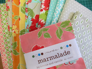
Which bundle do you think would appeal more? The Camille prints? Or the Vintage prints?


4 comments:
I like the Bonnie and Camille prints- it's a fun pattern deserving of fun fabric! I am a bit concerned about the size of some of the florals in the traditional stack.
Wow you are going great guns with your modern blocks. I like the idea of the Camille prints.
If you were making it for me, I'd want the vintage prints (just for future reference!). But since it's a school thing and probably aimed at kids in general, I'd go the Camille prints - a bit more upbeat and fun.
I like the Camille but then I probably should note in a disclaimer statement that I don't "do" vintage. I AM vintage, but that's something entirely different.....and we don't need to discuss it. :)
Post a Comment